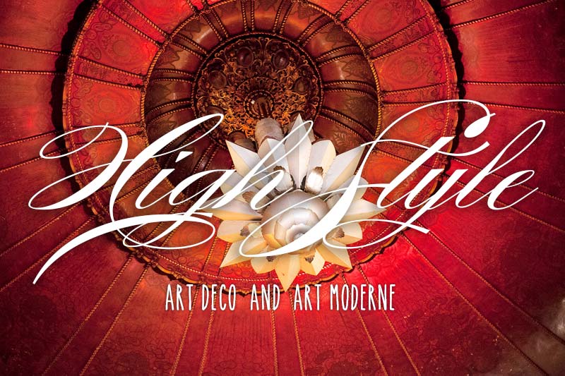
by Hänsel Hernández-Navarro (photo of San Francisco’s 1922 Castro Theatre by WindingRoad)
If there’s one thing we love about CIRCA, it’s the chance to “tour” the great vernacular architecture that makes America wonderful. Love art deco & moderne? You’re most certainly not alone! Join Hänsel as he teaches us all about the Art Deco & Art Moderne styles.
The earlier style, Art Deco, was more common in public and commercial buildings in the 1920s and early 1930s. The style is extremely rare in domestic architecture in America, but many Deco interiors were designed and built in American houses and apartments. However, it was more frequently used in the design of apartment buildings: the Miami Beach Art Deco District, and New York City’s Grand Concourse feature large concentrations of the style. Later in the 1930s, Art Moderne, or Streamline Moderne, became the prevalent style of commercial, public, and domestic architecture, and many more examples survive in every American city and town.
Art Deco – Origins
The name Art Deco is derived from the 1925 Exposition Internationale des Arts Décoratifs et Industriels Modernes which was held in Paris, and the term was coined in 1968 by British historian Bevis Hillier to describe the design and architecture of the 1920s and 1930s. Think of it as catchall term for design produced between the two World Wars.
The style took cues and inspiration from the various avant-garde painting styles of the early 20th- century: Cubism, Russian Constructivism, and Italian Futurism. But it also represented a marked reaction to the sensuousness and flowing lines (at times heavy) of the previous of Beaux-Arts and Art Nouveau styles. Much influence also came from the Middle East and Asia, and also for example, Ancient Egypt since Tutankhamen’s tomb and its treasures had been discovered in 1922. Closer in our continent, Pre-Columbian art and architecture of the Americas were of eminent inspiration.
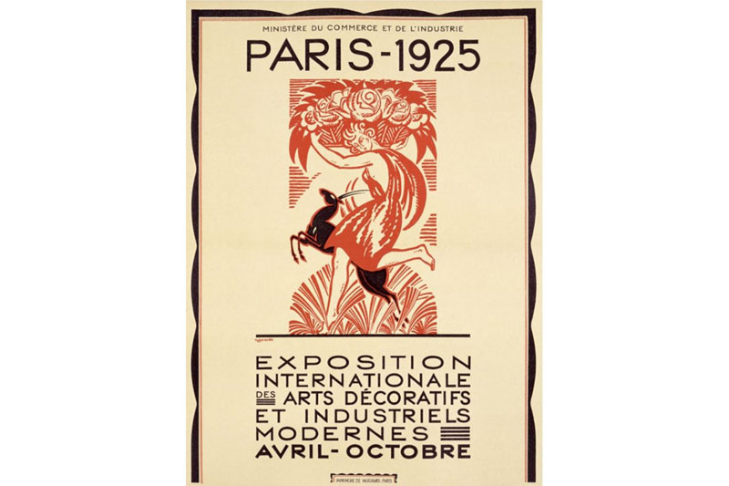
Exposition Internationale des Arts Décoratifs et Industriels Modernes poster designed by Robert Bonfils, 1925.
The Paris exposition was widely publicized in the press, and beginning in 1926, those who were not able to travel to Paris could visit exhibits on French decorative arts, which traveled to major American museums such as the Metropolitan Museum of Art in New York, which featured the work of designer Jacques-Emile Ruhlmann and the glass maker René Lalique. Meanwhile, society, fashion, cinema, home décor, and architectural publications continued to feature and spread the taste for the new style in every major US city, as did motion pictures, which had already become a great source of mass entertainment.
First American Deco Buildings
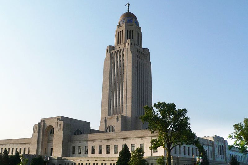
Nebraska State Capitol Building, Bertrand Goodhue, 1919.
Bertrand Goodhue’s Nebraska State Capitol Building of 1919, although it predates the designation of the style, is considered the first truly Art Deco building designed in America. It exhibits Art Deco characteristics in its primitive monumentality, its verticality, ornament, and abstraction. It is meant to resemble a Mesopotamian building: a lantern-topped tower with a lower, horizontal structure. There are Native American references in the building’s relief carvings, grill work, and mosaics.
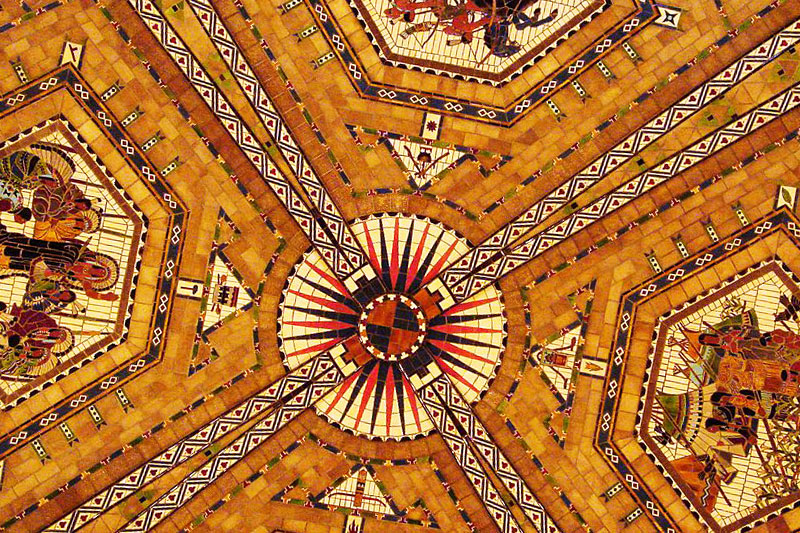
Nebraska State Capitol Building Old House Chamber Ceiling.
Eliel Saarinen’s 2nd place entry for a new headquarters for the Chicago Tribune, the 1922 world-wide competition, (it was only a drawing, it was never built), became very famous and influential in architectural circles. The simplified yet soaring vertical tower, featuring setbacks and little ornamentation, was deemed the most appropriate building for its time, and its modern design influenced many subsequent architectural projects, and quickly became the latest architectural fashion.
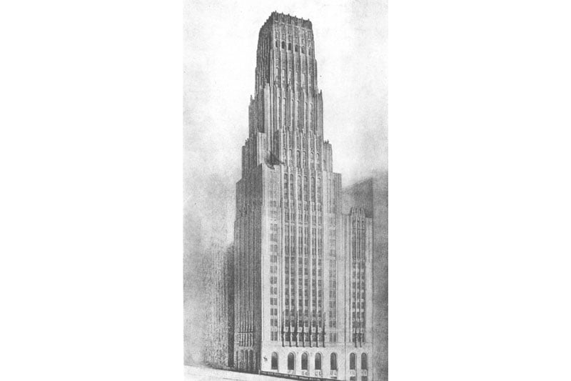
Eliel Saarinen’s 2nd place winner Chicago Tribune,1922.
Goodhue and Carleton Winslow’s design for the Los Angeles Public Library of 1926 was also eminently influential with its mosaic-covered, pyramid-topped tower and design motifs inspired by Pre-Columbian, ancient European, Persian and Egyptian themes. These buildings exemplify the transition from the predominant Beaux Arts style to the modern construction prototypes and decorative influences of Art Deco.

Bertrand Goodhue and Carleton Winslow, Los Angeles Public Library,1926.
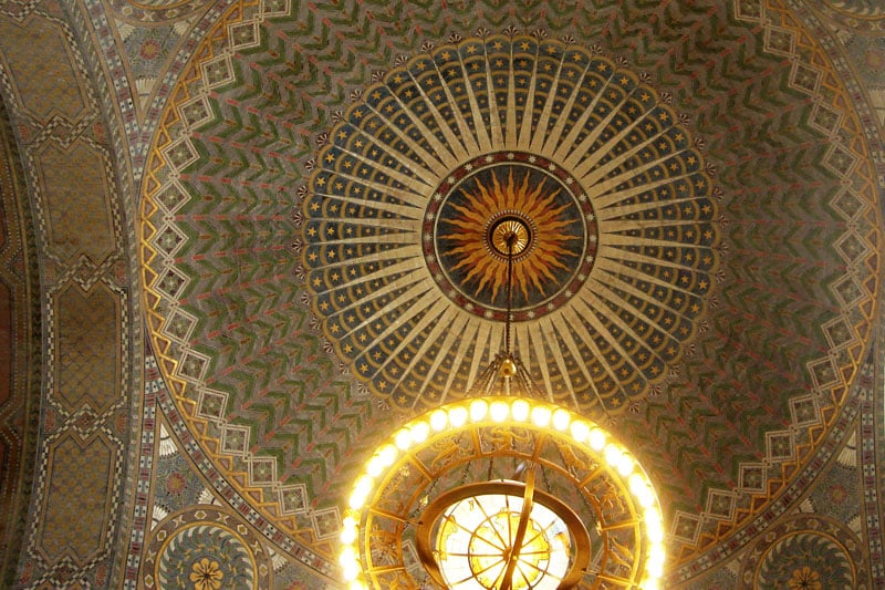
Los Angeles Public Library, interior dome ceiling.
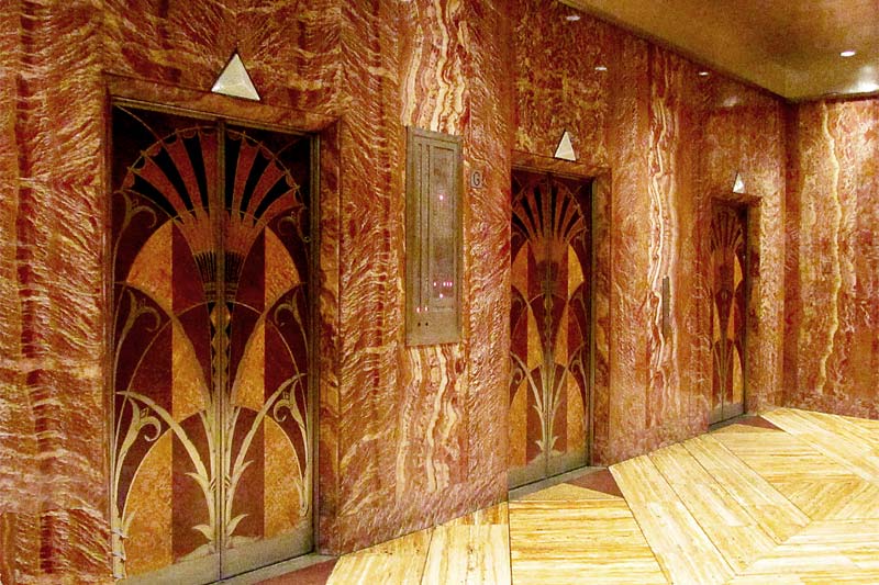
Chrysler Building, 1931, elevators banks. Photo by Andrew Middleton.
Art Deco Style’s Identifying Features
• Vertical emphasis
• Towers and other vertical projections above roof lines
• Setbacks (step like recessions in a wall)
• Smooth wall surfaces in stone, brick, or stucco
• Ziggurat and inverted ziggurat motifs
• Geometric ornament: parallel straight lines, zig-zags, chevrons, lozenges (diamond shaped)
• Stylized (abstracted) floral motifs
• Stylized figurative sculpture, especially bas relief
• Sunrise and floral patterns in ornamentation
• Intense colors in terra cotta, glass, colored glazed bricks, mosaic tiles
• Hard-edged low relief ornamentation around door and window openings
• Windows strips or ribbons with decorated iron grille work
• Metal double-hung or casement windows;
• Occasional circular porthole, oculus, round windows on main or secondary elevations
• The use and integration of new and experimental materials such as Bakelite (phenol-formaldehyde resin), Monel (copper-nickel alloy), aluminum, and Vitrolite (architectural glass)
The Streamline Decade – Art Moderne or Streamline Moderne: 1930 – 1945
In stylistic terms, Streamline Moderne represents the last phase of Art Deco. Whereas Art Deco is concerned with surface ornament, color and abstractions of natural forms applied as decoration on buildings, Streamline Moderne is essentially a machine aesthetic focused on mass production, functional efficiency, and a more abstract aesthetic coming from the Bauhaus in Germany and the “white architecture” of Europe: The International Style. As the world was transitioning from the exuberance and richness of the “Roaring Twenties” and into the grips of austerity and self-discipline of Depression-era 1930s, the high-style architects were pushed aside in favor of industrial designers.

The Pan Pacific Auditorium, Los Angeles, Wurdeman & Becket, 1935.
These designers began to favor simpler, aerodynamic lines and forms in the modeling of ships, airplanes, and automobiles. In the modern machine age smooth surfaces, curved corners, and an emphasis on horizontal lines give the feeling that airstreams could move smoothly over and under them. This streamline aesthetic was put in service of everyday objects and activities of a democratic society: fast food, cheap travel, appliances, and the automobile. Roadside diners, motor hotels (motels), cinemas, early strip malls and shopping centers, seaside marinas, and air and bus terminals all borrowed forms and profiles from the designs of railway trains, ship hulls and ocean liners, airplane fuselages and the latest coupes and sedans.
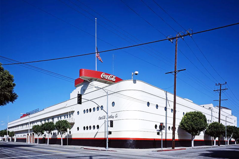
Coca-Cola Bottling Plant, Los Angeles, CA, Robert V. Derrah, 1939.
Without a doubt, prominent expositions and fairs during the 1930s in the US were major advocates and proponents of Streamline Moderne, and they helped and continued to spread the taste and preference for the style. These were: the Chicago’s Century of Progress World’s Fair of 1933-34; Dallas’ Centennial Exhibition of 1936; the New York World’s Fair of 1939-40; and the the San Francisco Golden Gate International Exposition of 1939.
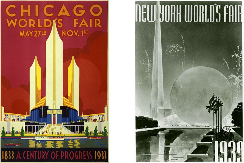
Chicago’s Century of Progress World’s Fair of 1933-34; the New York World’s Fair of 1939-40, The World of Tomorrow.
Art Moderne or Streamline Moderne’s Identifying Features
• One-story buildings
• Horizontal emphasis and orientation
• Anchored to the ground
• Asymmetrical facades
• White is predominant color
• Rounded edges
• Corner windows
• Glass block walls
• Mirrored panels
• Ribbon band of windows with metal frames
• Stringcourse along coping of wall
• Flat roofs
• Curved canopies
• Smooth wall finish
• More utilitarian and functional metals like aluminum, chrome, and stainless steel used for door and window trim, railings, and balusters
• Metal double-hung or casement windows
• Occasional circular porthole, oculus, round windows on main or secondary elevations
• References to the sea/the ocean: curves, horizontal vectors and lines, and light blue finishes like aquamarine, azure, baby blue, cyan, teal, and turquoise
In most buildings types, both the horizontal Streamline Moderne and the vertical Art Deco influences occur in combination, and Streamline Moderne buildings with a few Deco elements are not uncommon. Sometimes it is difficult to differentiate between the two. In tract development, elements of the Streamline style were sometimes used as a variation in postwar row housing. One example is San Francisco’s Sunset District. However, due to relatively little new construction in small American towns during the great Depression and the war years of the 1940s, the Art Moderne style was often used to “modernize” older commercial storefronts.
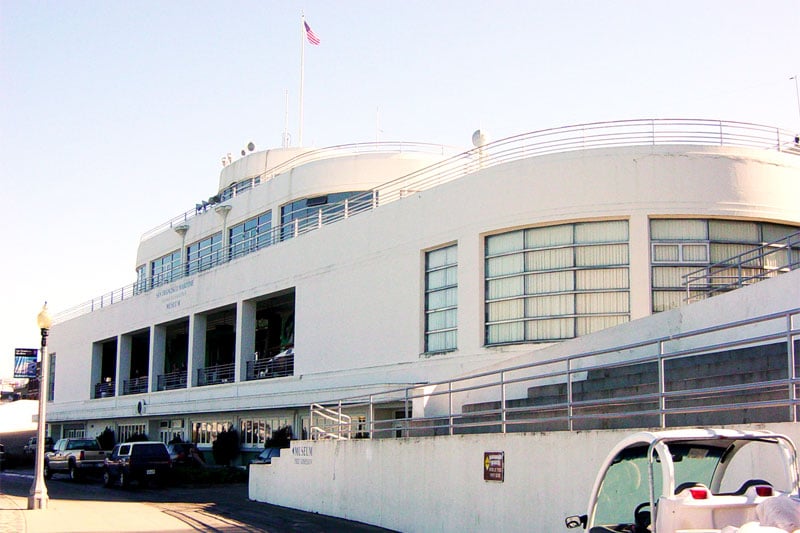
San Francisco’s Aquatic Park, Museum, Works Progress Administration, 1936.
Miami Beach Art Deco District
One famous cluster of Art Deco and Streamline Moderne buildings in a extraordinary combination of designs among various architects can be found in the hotel and apartment district of Miami Beach, Florida, which developed between 1930 and 1942. Primarily situated along Ocean Drive and Collins Avenue, most of the “South Beach” structures display a restrained Art Deco aesthetic expressed in predominantly white or pastel colors and enhanced by streamlined details, sometimes almost nautical in form, and full of ‘tropical deco’ decorative detail and clean modern logos and graphics.
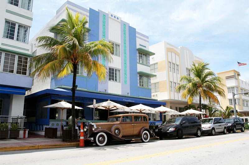
Ocean Drive in Miami Beach, Florida, 2008.
New York’s Grand Concourse
The Grand Concourse amazingly contains a high concentration of Art Deco buildings. The boulevard was completed in 1909 in New York’s northern borough of The Bronx. But the bulk of the buildings on it date from the 1920s through the 1940s, and up to the late 1950s. Famous architects did not design these buildings, but they left a considerably good grouping of buildings in this style.
The facades of these buildings are remarkable in two respects:
• One involves the imaginative way the architects used setbacks, recessed entryways, and rounded corners to break up the typically flat exterior wall.
• The other has to do with how architects manipulated mosaics, glass, metal, brick, cast stone, terra cotta, and expensive woods to underscore these effects and at the same time to appeal powerfully to the senses.

Grand Concourse Bronx, New York.
Eventually these two popular building styles would be largely superseded by the minimalism of the International Style in the 1950s and early 1960s.
 AUTHOR HÄNSEL HERNÁNDEZ-NAVARRO
Hänsel Hernández-Navarro is an architectural conservator specializing in the preservation and rehabilitation of historic buildings and monuments, and cultural resource management. He received his Masters in Historic Preservation from Columbia University. He lives in New York City and has worked for the New York City Landmarks Preservation Commission, the Getty Conservation Institute, the National Park Service, The American Academy in Rome, and the Museum of the City of New York.


